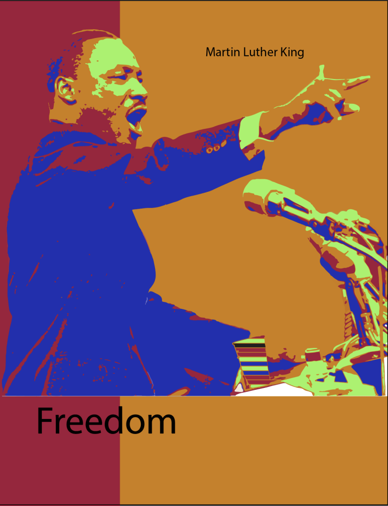
My art has a beautifully contrasted look. The colors you see are maroon, orange, blue, and lime green. The person you see within my art piece is Martin Luther King. I feel these strong colors are inspired by the strength King had. When you look at my piece you see the word freedom. This is what Martin fought for throughout his life and exemplifies freedom for all. I used two different computer editors to create my poster these were Illustrator and Photoshop, both were the tools I used. The big Idea would be Martin Luther himself, he was the inspiration and the idea behind my piece, it was a tribute to him and his work. I hit all the right goals I wanted to hit and It came out better than I expected. This inspired me to create more posters like this I feel they are very aesthetic to look at.
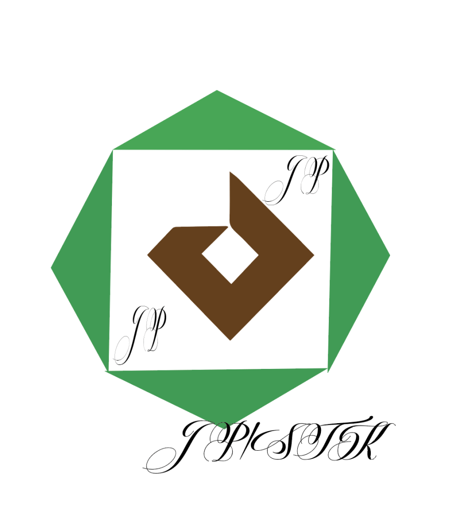
I designed my logo and brand around a recycling affordable clothing brand for low-income people. My brand emphasizes style and fashion without having to pay for overpriced streetwear. And also comes with a recyclable fabric which adds to the culture of my brand and saves everyone money. My logo has a symmetrical sign inspired by the classic recycling symbol, with a twist of a sleek look. My target audience is the low-income community because I feel everyone deserves to feel stylish even if they don’t have the funds to do so. My logo appeals to anyone who likes streetwear but what appeals more is the price tag. I’m most proud of the concept behind it. I think this brand could be successful with the right marketing and the right people behind it. Something I could have done better was make a bunch of different colors and similar designs to see which one appealed the most.
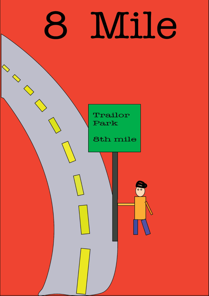
The subject I used for my poster was the movie 8th Mile. I chose this movie because it’s a beautiful story of a broke rapper that made it big. It was very inspirational for me to see this movie and has become one of my favorites. What I like most about my poster and the art behind it would be the loud colors like the red background that screams at you and grabs your attention. I also like the sigh that shows where the rapper Eminem grew up. It gives the same vibe as the movie itself. What I would say to someone doing this project would be to stay creative and make it personal to how you see whatever movie you choose. If you really enjoy certain parts make sure to include that within your project.
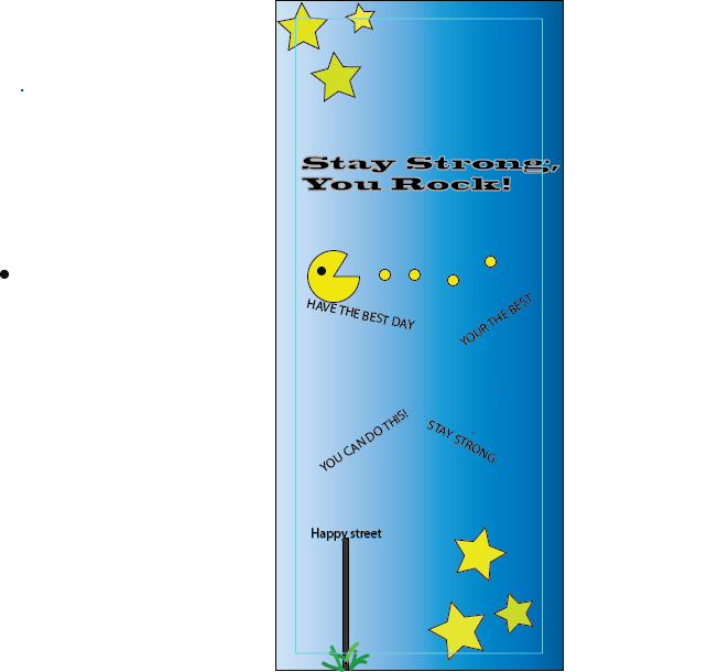
My card for kids features a blue background depicting a sky faded with a nice sky-blue color. I used Pac-Man since it’s a fun kids’ game that represents happiness. I used yellow as a core color which are the colors of my stars in each corner. I thought that words of encouragement were essential to finishing my card. I displayed them throughout the card to finish off my card. I think overall my card displays happiness and encouragement which is what I was going for.
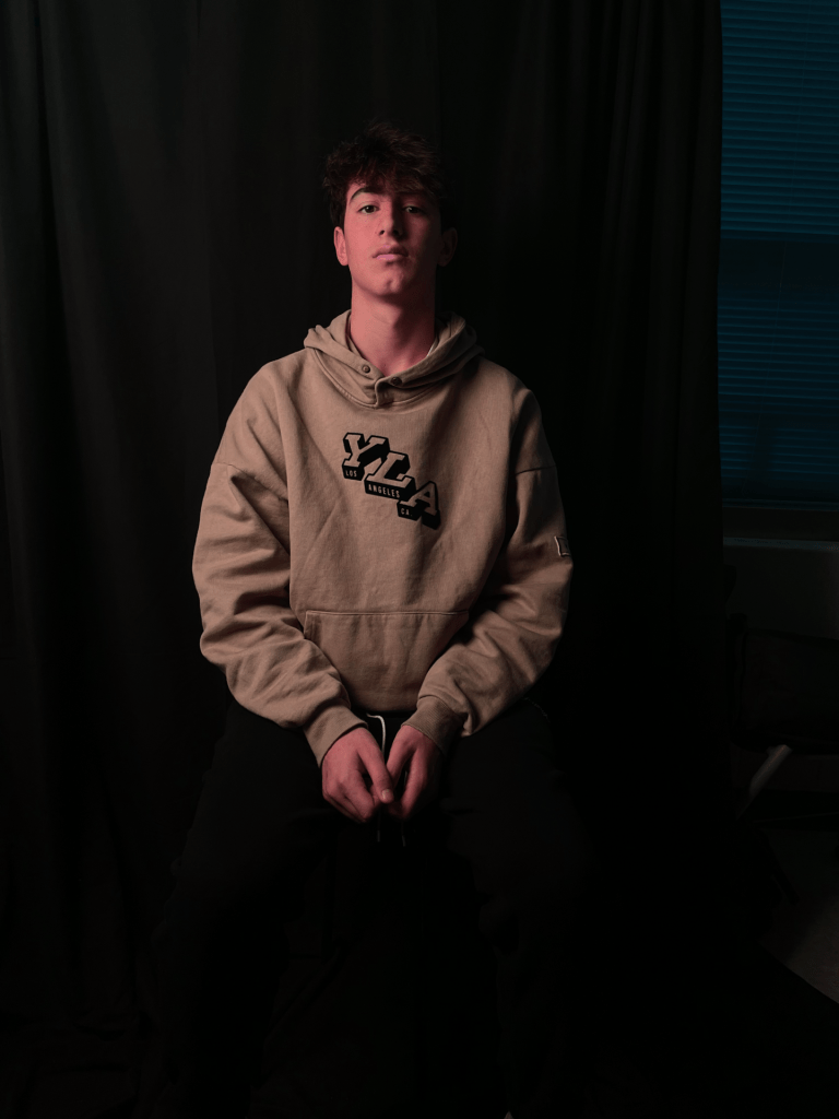
My favorite photo I took was the split lighting picture. This is the photo I’m most happy about because of the way it looks. The half-light dark lighting on the face gives a lot of emotion within the picture.
The lighting I can use for future projects would be the split lighting because of how cool it turns out. I love the angle I took, the split photo has the most character out of all the photos I used. I will look to take split-lighting photos in the future.
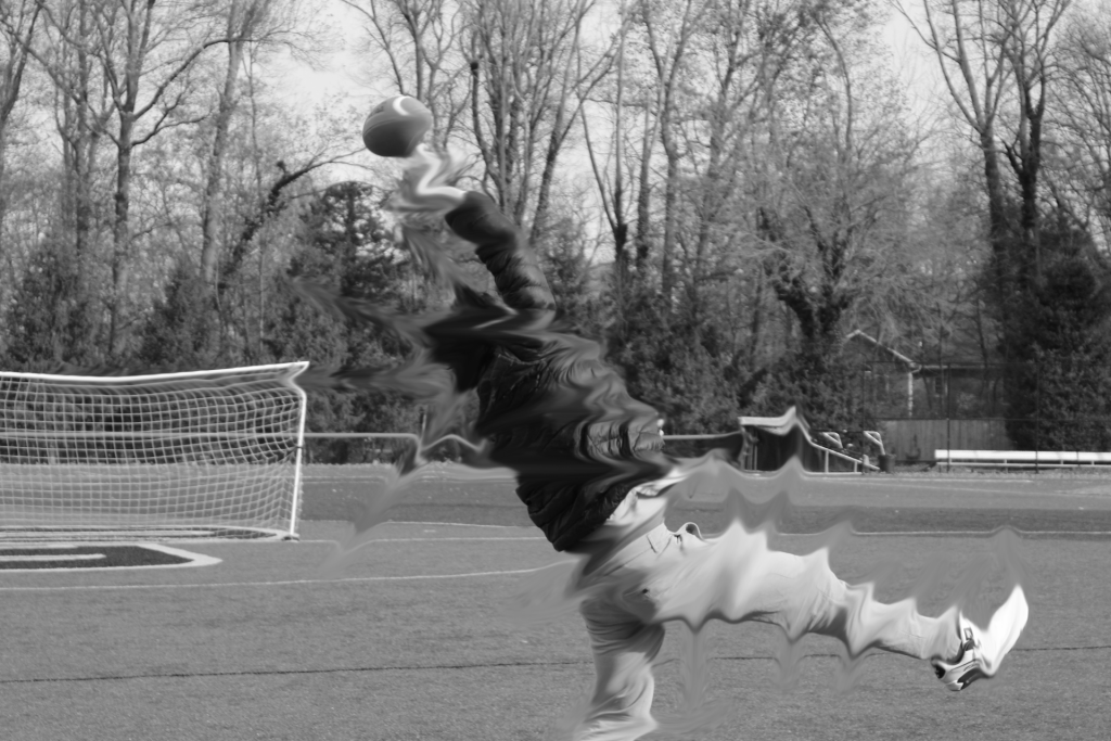
The advice I would give photographers who want to take motion shots would be to always have fun with it. Since it’s in motion you want to have authentic movement to capture pure shot. When it comes to motion shots the more unforced the shot is the better it looks.
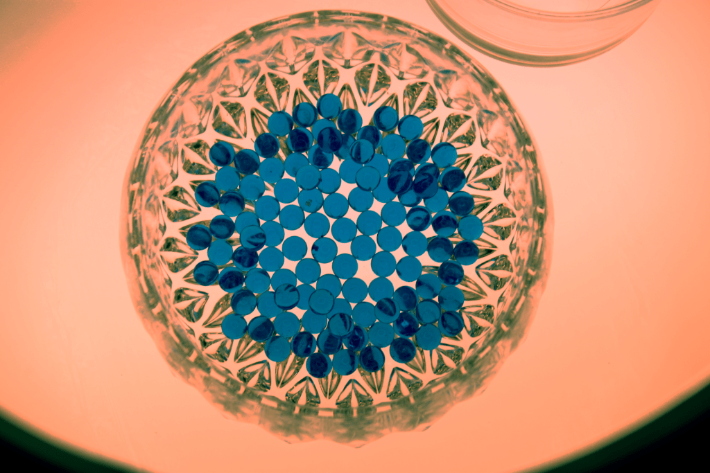
The distinct mood of my photograph is a peaceful cup of beads. the thing I like most is every bead is exactly the same. This photo makes me think of my birthstone and crystals which are both beautiful peaceful objects. What jumps out is a bunch of perfect circles. My advice would be to take your time and make sure you get the right shot.
refraction
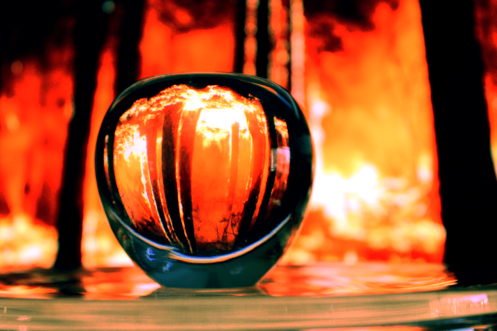
This mood is like craziness in an apple. This photo makes me think of a crazy fire but the calm view in the middle is beautiful. What jumps out to me is the fire that is in the background. This photo actually calms me in a way. The advice I would give is to stay creative within the limits you provided.
shadows
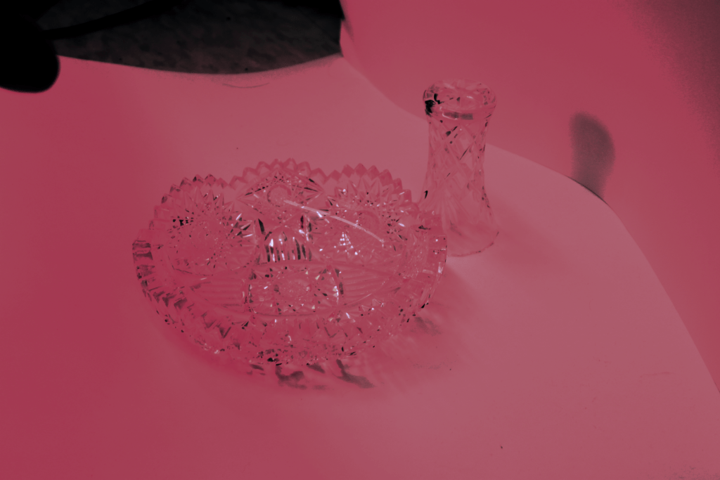
This is a mood of calmness. This photo makes me think of a studio because of the dark shades. What jumps out to me is the glasses in the photo. advice I would give is to always make sure your angle works out for you.
My image shows a contrast of old school rulers and recent time presidents both of these people are in power at some point in time with completely different times. I used the King and Obama because I wanted to make a connection between old school and new school. I think my edit came out exactly how I wanted. My edit is a statement of different cultural times. Integrating the two made the picture alive. The advice I would give someone trying to create a composite image would be to make sure there is a meaning behind the image, as well as while editing take your time to really blend the photos to make the picture come alive.
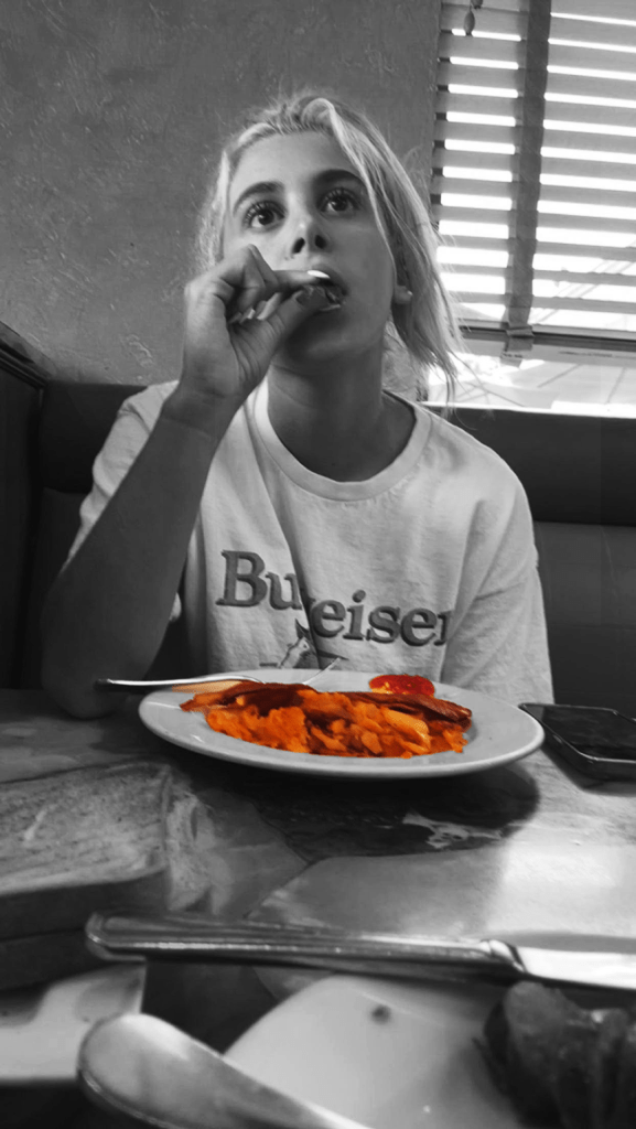
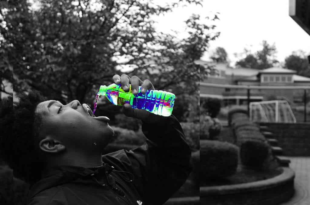
I chose these certain foods because of the value they bring to each picture. In the first one, my Girlfriend got her usual order every time we went to get food in the morning which gave meaning to me. For the second one, I had this vision of changing water to a different color while someone drinking it and it turned out well.
The first picture is taken in the morning which gives me a warm safe feeling at a comfy diner with light shining through the window. The second one is a gloomy day with light in the sky and in the background, but focuses on the kid drinking the water.
In my first one, I cropped the photo to have food and my girlfriend be the main focus. In the second one, Jalen’s head was cropped in a box that overlapped the original photo.
I think the color splash in my photos makes everything come alive in my photos. You can see the food and watercolors changed. This gives more than a black-and-white picture feel.
I used the regular Canon camera for the one with the water but for the diner picture, I used my iPhone which still caught a great photo. I think there is a difference in quality but overall both pictures look great.
Great advice I would give to students is to capture people and objects you really love and want to take. Meaningless pictures are cool but I think they are way better when they have emotional meaning behind them.
spaceshape geometricdepthcolorMan made linespacetexturevalueorganic shape
1. What strengths and weaknesses do you see in your own work?
In my own work, I see some of my angles lacking and in general feel I could have taken better pictures. Some strength was how I caught texture and shape. I feel I keep getting better at finding my photography style.
2. How might you improve or refine your approach in future photography projects? In the Future I will take more time while taking pictures to make sure my angle is perfect and the picture I took satisfies me. Overall though I feel I could have done better but it gives me a certain respect for photography. This is why I want to get better at taking these pictures.
3. Pick one of your photos, what emotions or messages did you intend to convey through this photograph? The picture with the brick wall that shows texture shows a grit emotion and almost a hard cutthroat feel of the wall. I like this because seeing the emotion through the photo makes me feel good that I was able to create emotion through a picture.
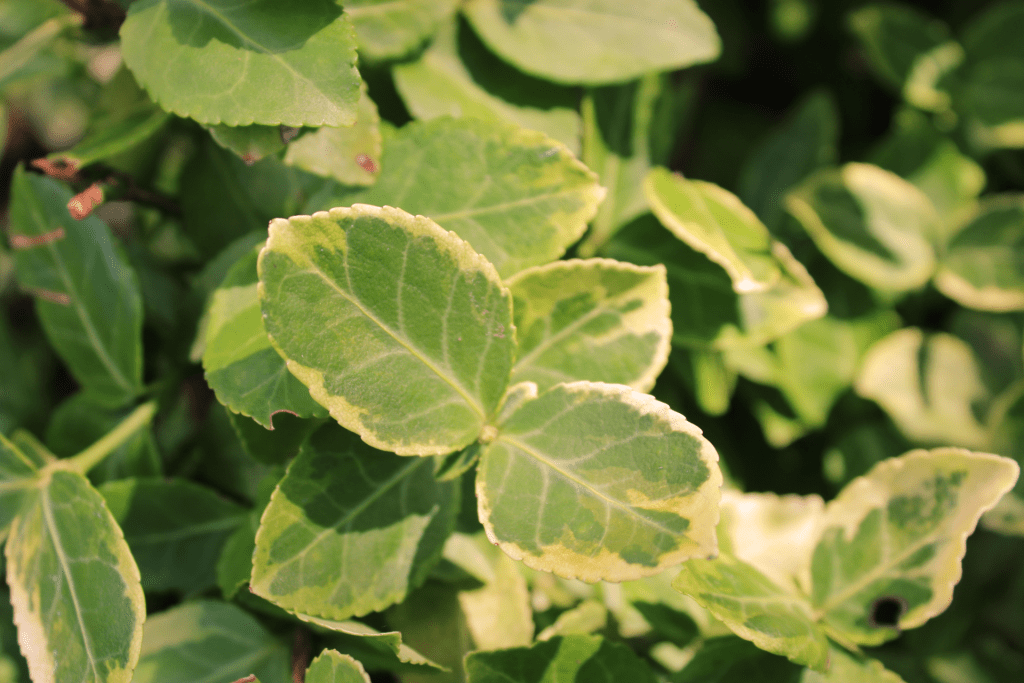
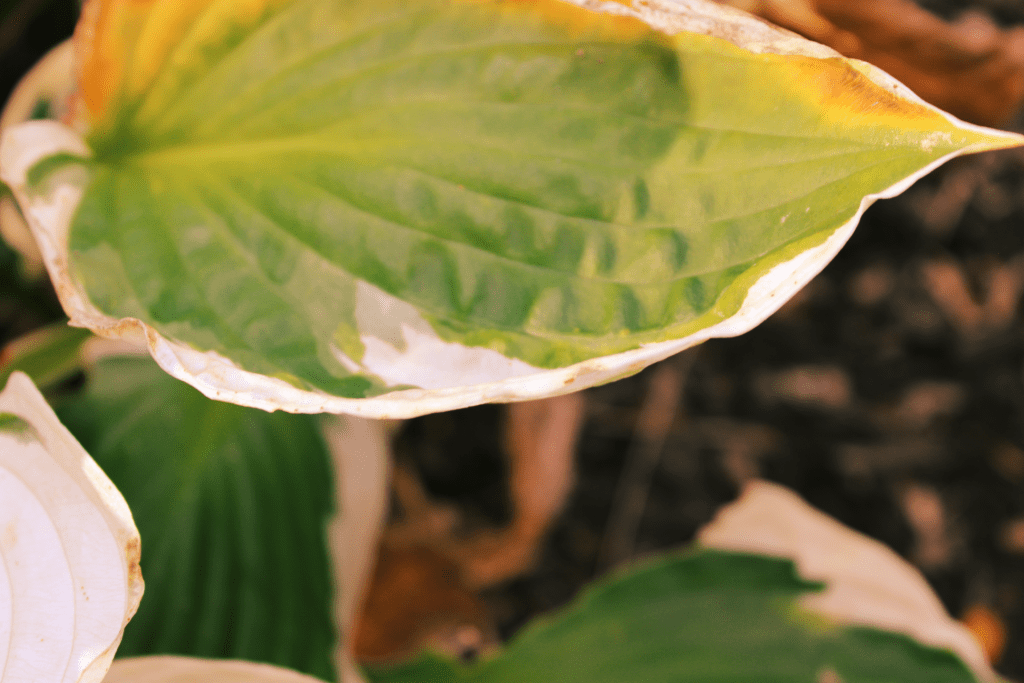
4. Are there specific elements of art you would like to explore further in your photography? I would like to capture more texture with the camera because the little details fascinate me. When it comes to photography shape is the most aesthetic to me, as I continue to take pictures shape will always be in my photos.
5. What concepts or techniques do you want to experiment with in your next project?
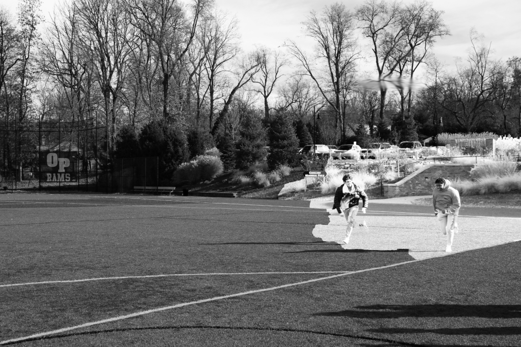
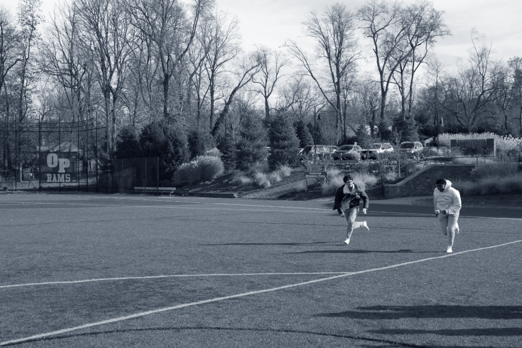
There are many different techniques that I would like to use, one in particular is action shots because of the amount of feeling and emotion in them. I feel action shots can tell a story by just looking at the photo. this is why I would like to use these in the future.