

1. What strengths and weaknesses do you see in your own work?
In my own work, I see some of my angles lacking and in general feel I could have taken better pictures. Some strength was how I caught texture and shape. I feel I keep getting better at finding my photography style.
2. How might you improve or refine your approach in future photography projects? In the Future I will take more time while taking pictures to make sure my angle is perfect and the picture I took satisfies me. Overall though I feel I could have done better but it gives me a certain respect for photography. This is why I want to get better at taking these pictures.
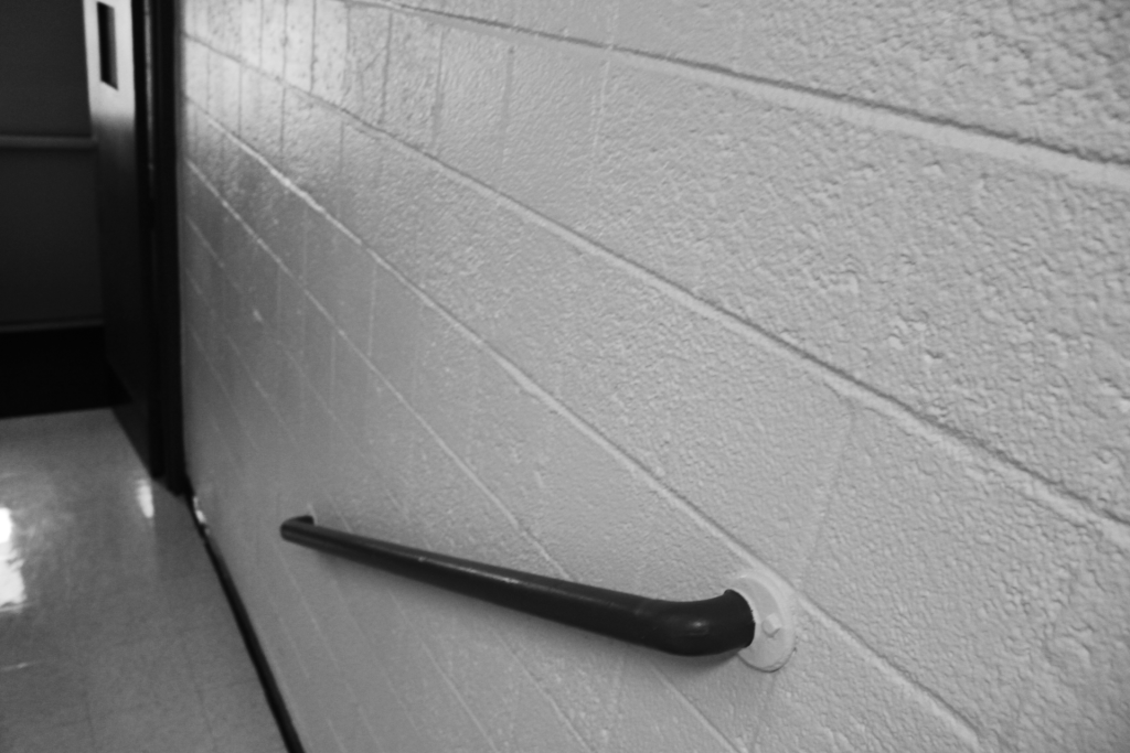
3. Pick one of your photos, what emotions or messages did you intend to convey through this photograph? The picture with the brick wall that shows texture shows a grit emotion and almost a hard cutthroat feel of the wall. I like this because seeing the emotion through the photo makes me feel good that I was able to create emotion through a picture.
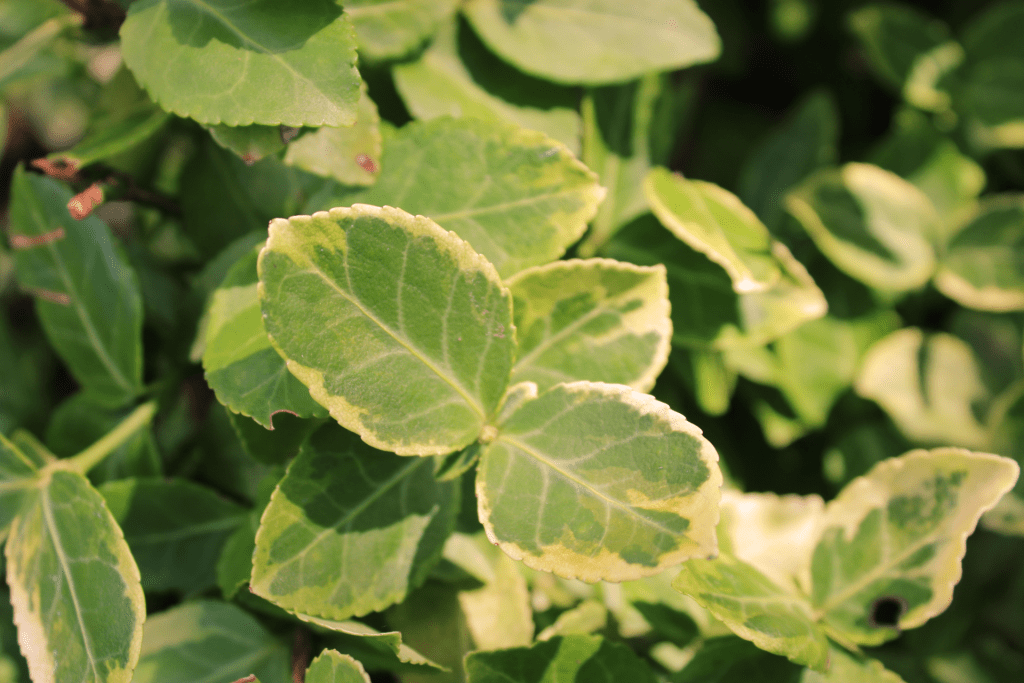
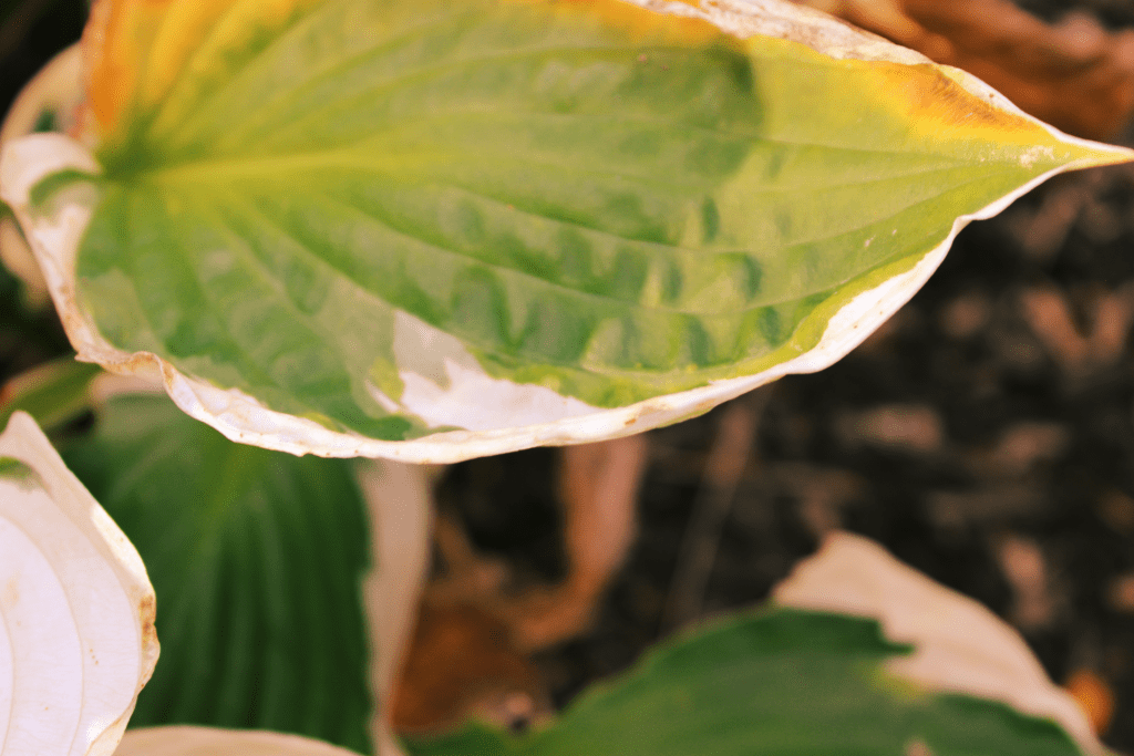
4. Are there specific elements of art you would like to explore further in your photography? I would like to capture more texture with the camera because the little details fascinate me. When it comes to photography shape is the most aesthetic to me, as I continue to take pictures shape will always be in my photos.
5. What concepts or techniques do you want to experiment with in your next project?
There are many different techniques that I would like to use, one in particular is action shots because of the amount of feeling and emotion in them. I feel action shots can tell a story by just looking at the photo. this is why I would like to use these in the future.
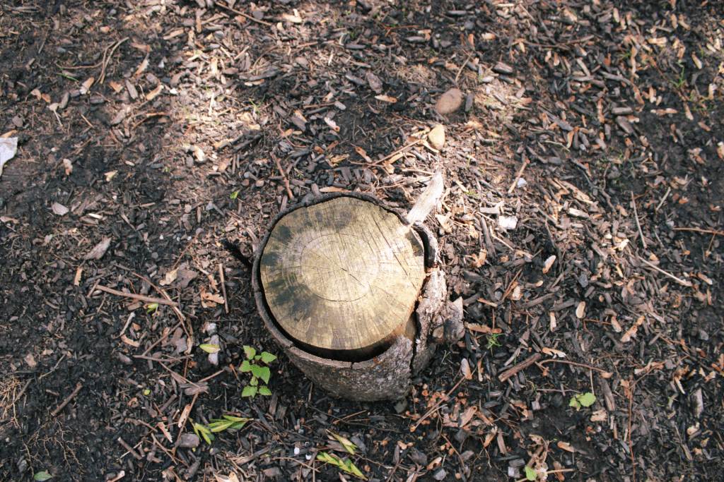
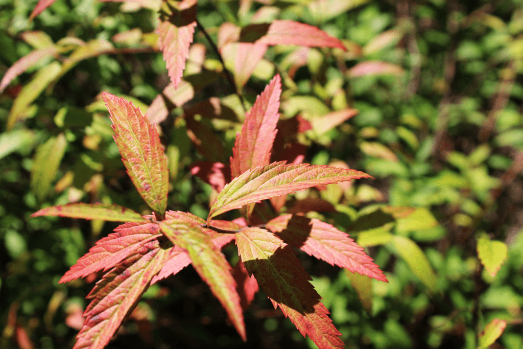
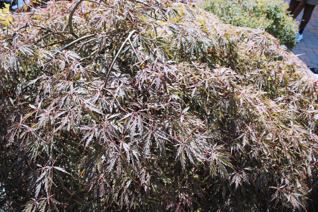
My favorite picture is the geometric shape, because you could tell that it is a natural shape and a geometric one. Another one that I like is the form, you could tell it is 3d from the editing and shadows. One picture that could be better is color, it is very close up and looks kind of blurry, something you could do better is zoom out and use a different lens. The composition technique that I can see is FILL THE FRAME in the space picture, since it’s close up and looks good.
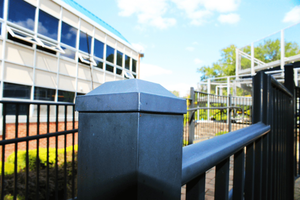
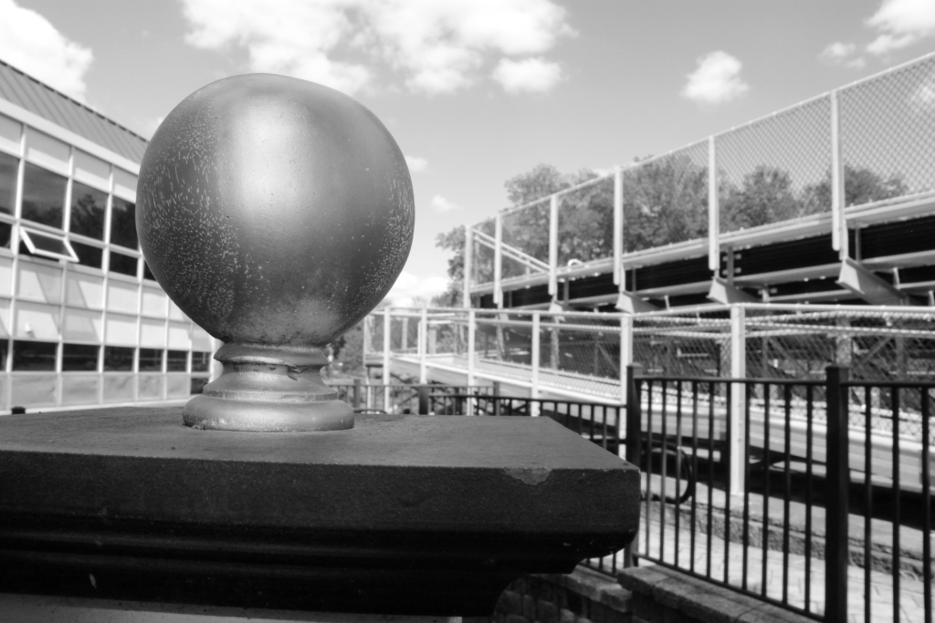
The 2 photos that I felt were the best in your blog were the value and form. I liked the value the most because everything about it was good. There was nothing bad about it. I liked the form because I could really see the 3d. One photo that I think could be better is the man made line. I feel like it could be better if it was more so focused on the man made line instead of the man made line, railing and all the other stuff on the left. IN YOUR TEXTURE PICTURE, I SAW THAT IT LOOKED LIKE FIGURE TO GROUND BECAUSE IT WENT FROM BEING LIGHT ON THE LEFT TO BEING DARKER ON THE RIGHT.
Critique: The two focus that captivated me was the one showcasing organic shapes and emphasizing texture. The organic shape immediately caught my att due to its unique creative perspective. Your bird’s eye view added a layer of intrigue, engaging the overall composition. Equally compelling was the texture shot taken at the budling’s corner. I appreciated the selective focus on a specific area of the brick, which helped enhance the phot by accentuating textures and creating a visually intriguing photo. However, one photo that I feel you could have done better on was the color photo. I’m not quite sure what the actual thing you took the picture was, and the color was quite dull. To improve on this I feel like you could have added a variety of colors, and not just focused on one photo, and also you could have made the value higher to give it more of a pop. Notably, one composition technique that stuck out to me was LEADING LINES. The texture photo portrayed this as the lines on brick were leading me to the center focus of the photo.